Let’s understand in detail how to test the mobile version of your website yourself. We ourselves use these steps in our work and in testing and developing websites.
Visit statistics show that from 60 to 95% of visits to the site are made from mobile devices. Therefore, it is important that the mobile version of the site, as well as the site itself, meets the user’s expectations and provides a quality user experience.
What to test in the mobile version
Display on different screen resolutions and browsers
The main functions of the site work correctly on mobile devices
Site loading speed and responsiveness on mobile devices.
Ease of navigation and use on mobile devices.
Testing for adaptability
Adaptability means that the site displays correctly on different devices with different screen sizes – from large monitors to small smartphone screens.
The purpose of adaptability testing is to make sure that the site:
- Displays correctly on different screen resolutions.
- Maintains usability across devices.
- Ensures all content is accessible regardless of screen size.
Adaptability testing via mobile phone
Testing on real devices is the most reliable way to test a website on real mobile devices (smartphones and tablets) with different operating systems (iOS, Android) and browsers (Chrome, Safari, Firefox).
We take our own phone, open our website. We will conduct real manual testing.
We look at:
- Page layout:
- Block rearrangement: make sure that the blocks on the page are rearranged correctly when the screen size changes.
- Horizontal scrolling: avoid horizontal scrolling on mobile devices.
- Check how the site looks at different resolutions (320px, 375px, 480px, 600px, 768px, 1024px, etc.)
- Make sure that the content does not go beyond the screen boundaries.
- Navigation:
- Menu: make sure that the menu is convenient to use on mobile devices (hamburger menu).
- Links and buttons: make sure that all links on the page are visible, all buttons are large enough to be pressed with a finger.
- Interactive elements
- Forms: make sure that the input fields are large enough for easy text input on mobile devices.
- Buttons and links: easy to click on touch screens.
- Typography: is it convenient for you to read
- The text is large and easy to read on mobile devices.
- Line spacing and indents between paragraphs are comfortable to view.
- Words are transferred correctly so that the text does not go beyond the screen.
- Images and video
- Images are not distorted when the screen size changes.
- Sliders (scrolling) work correctly on touch devices.
- Video scales depending on the screen width.
- Cross-browser testing: Check in popular mobile browsers: Chrome, Safari, Firefox, Edge.
Click on all the buttons you see, read pages, open photos, watch videos, share pages on social networks – your task is to test your site as much as possible. See what you don’t like or are uncomfortable with – take a screenshot, add a link to the page, describe the problem and send it to your website developer.
Not always your view of the problem will be correct, because the main visitors to your site may see it differently.
We perform adaptability testing on more than 25 parameters. Want a mobile adaptability analysis from professionals?
Testing the adaptability of the mobile version on a computer
Most modern browsers have developer tools. They have a device emulation mode that allows you to simulate different screen resolutions and even device types (phones, tablets). This is a very useful tool for testing. Open the site in the browser and call the developer console.
Chrome Browser
- using the mouse – right-click to open the menu and select “View code”
- using the keyboard – Ctrl+Shift+I will open the developer console
- for MacOS – F12 or Cmd+Opt+J
FireFox, Edge and other browsers
- using the mouse – right-click to open the menu and select “View code”
- using the keyboard – Ctrl+Shift+K will open the developer console
- for MacOS – F12 or Cmd+Opt+K
Safari
First you need to switch on the Developer Console:
- Preferences and go to the Advanced panel. At the very bottom you will find a checkbox “Show Develop menu in menu bar” tick it. To call the console use – Cmd+Opt+C
- Click on the mobile phone icon and you will see how the site is displayed on phones. In the console you can select popular brands of phones / tablets and test the site on them.
Console is a simulator of the site on a mobile phone, so the actual errors are still better to see on a live phone. Using this method you will get a general idea of the site operation, but you will not be able to identify errors in the work.
Automated testing of the mobile version of the site
There are online services that allow you to test the adaptability of your site on different screen resolutions. They make screenshots of the site on different devices and provide a report.
To get an idea whether search engines see your mobile version of the site correctly, use test services:
- From Google – https://search.google.com/test/mobile-friendly
- From Bing – https://www.bing.com/webmaster/tools/mobile-friendliness
- From Yandex, it is located in Webmaster
Other ways of testing
There are more ways of testing on emulators, different sites analysers, both paid and free. But all these services are designed for professionals and are difficult to understand the results of testing. For you to check your own site, the above methods are more than enough for the rest, trust the rest to your website developer.
Functionality of the mobile version
Functionality testing of the mobile version of the website is to verify that all interface elements and functionality are working correctly. This point is critical, as users should be able to perform all key actions on the site regardless of which device they are accessing it from.
Functionality testing via phone
Open the site on your smartphone and also perform manual testing.
What is included in the functionality check on mobile devices:
- Navigation:
- Menu: make sure that all menu items open correctly and lead to the correct pages.
- Links and buttons: all menu items open correctly and lead to the correct pages.
- Transitions between pages: internal links, “More” buttons, “Back”, “Forward”, etc.
- Check the site search.
- Forms:
- Check all text fields, drop-down lists, radio buttons, checkboxes. Text input is correct and the fields are limited (there is a ban on entering letters in the phone number field).
- Check the sending of all forms on the site: feedback forms, registration forms, authorization forms, order forms, etc. Make sure that the data is sent correctly and processed by the server.
- Make sure that error messages are displayed correctly and are clear to the user.
- Check messages about successful sending or an error.
- Interactive elements:
- Check the pressing of all buttons (correct reaction to a click, transition to the desired page, execution of the action).
- Check the correct operation of the filters.
- Check the scrolling of slides in Carousels.
- Pop-ups: make sure they close when you click on the “cross”, the “Close” button or outside the window area.
- Images and videos: check that all images and videos are displayed correctly. Make sure that interactive elements (for example, the “Play” button) work.
- For online stores: check the operation of registration, order basket, adding products to the basket and placing an order. Making a payment.
This plan will allow you to thoroughly check the functionality of the site, detect bugs and make sure that all elements work stably on mobile devices.
How to open the mobile version of the site on a computer is described in detail in the block – adaptive testing.
We conduct mobile version functionality testing according to 40 parameters. Do you want an analysis with recommendations for optimizing the mobile version from professionals?
Performance of the mobile version of the site
Performance is the speed of loading and responsiveness of a website to user actions. Poor performance can result in lost visitors, lower conversions, and poor search engine rankings.
The purpose of performance testing:
- To measure the loading speed of the website on mobile devices.
- Identify issues that are slowing down load times.
- Optimise your site to improve performance.
To analyse your loading speed, use
Google PageSpeed Insights. This is one of the most popular and convenient tools developed by Google. It analyses the loading speed on both desktop and mobile devices, gives performance estimates and provides recommendations for optimisation.
Conducting Testing:
- Enter the URL of the site in the selected tool: Usually it is enough to enter the address of the main page of the site.
- Wait for the analysis results: The tool will analyse the site and provide a report.
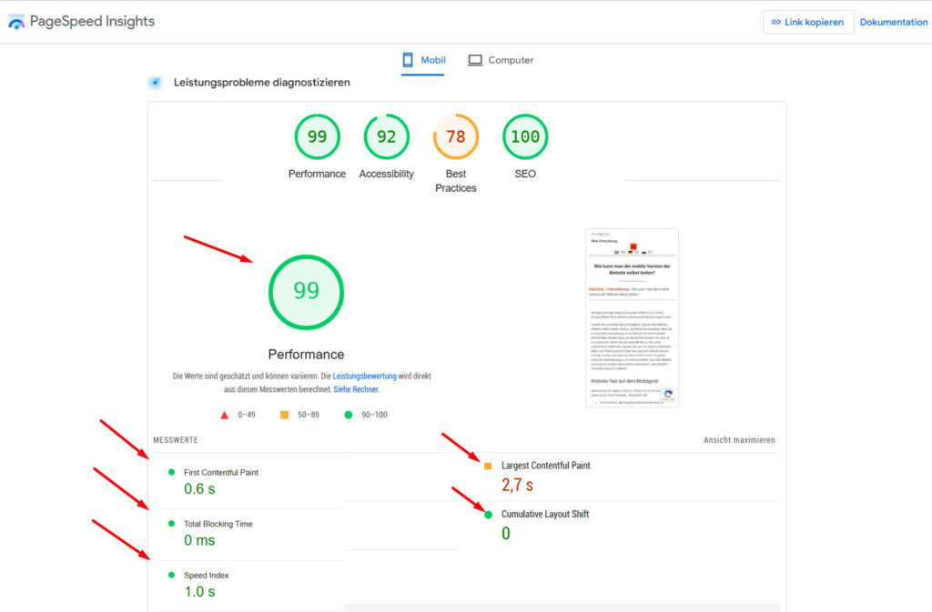
Performance Analysis:
- Pay attention to the overall performance score:Usually a scale of 0 to 100 is used, where 100 is the best score.
- Explore metrics to pay attention to:
-
- First Contentful Paint (FCP): Time torender the first content element on the page.
- Largest Contentful Paint (LCP): Time to render the largest content element on the page.
- Time to Interactive (TTI): Time until the page is fully interactive, when the user can interact with the elements.
- Speed Index: The average speed at which the visible part of the page loads.
-
Ease of use of the mobile version of the website
Usability testing of the mobile version will assess the ease and convenience of using the site from mobile devices.
The main usability parameters include:
- Clear structure and navigation
- Simple and intuitive navigation: the user can easily find the necessary sections and information.
- Logical structure: grouping content by categories, dividing it into main, subpages and sections.
- Menu: accessible, with clear names of items.
- Convenient to use search on a mobile device
- Links and buttons are large enough to be pressed with a finger
- Content and its presentation
- Fonts are clear, large enough, with optimal intervals.
- Contrast between text and background
- Convenient forms, buttons, suitable for touch input
- Relevance: information is fresh and useful. Minimum “water” – the text should be clear and not overloaded
- Touch control
- Convenient to use the site on a touch screen
- Gestures (swipes, taps, scaling) are processed correctly
- Screen orientation: correct display of the page in both portrait and landscape orientation
- Feedback
- Contact forms are convenient for contacting support
- Action confirmations are configured: notifications confirming the successful completion of tasks (for example, sending a form).
- Reviews: it is possible to leave and read reviews.
- Intuitive: Is the site interface clear to users? Can they easily perform the necessary actions without additional instructions?
- Payment and checkout (for online stores): Is it convenient to add products to the cart, place an order and make a payment from a mobile device?
These parameters together affect how users perceive the site, how willingly they use it and whether they return to it again.
Regular usability testing helps to find and fix errors, reduce bounce rates and improve user experience, which will affect search engine rankings.